Friday, August 31, 2012

Shame on me!

Twerk Laser (12x12in, aerosol on canvas, 2012)

Ok — shame on me!! Leaving for so long without a single update, without even announcing the winner of the Broken Arrow contest!? Ridiculous! To be honest, I haven't been feeling great for the past while, but that's definitely no excuse. Well, now that we're here, onwards to the Broken Arrow contest results! The mystery prize, Twerk Laser, can be seen above. Please give it up for the winner, one Alex Ross of Calgary, Alberta, Canada. This was actually a hella tough decision. I was lucky enough (thanks so much everyone!!) to get a ton of thoughtful, well articulated, original and insightful submissions. I was totally overwhelmed by both the number and quality; I was driven into the lab like a madman wanting to create more work, stronger work. Alex's submission got the win because it was poignant and concise (something I often struggle with in my own writing), and powerfully honest. It gave me a totally new perspective on Broken Arrow, and the Singularities series in general, and how it could be read. I really want to thank everyone again for sending something in, I learned so much about the work I create through how you saw it. I've read all the submissions at least 9 or 10 times, some more, and so many people putting time, energy, and thought into their responses is seriously gratifying and hella motivating. Much love!

Broken Arrow (36x24in, aerosol on canvas, 2012)


I don't have room to share all of the submissions in full, but I wanted to share excerpts from a few of my favourites (I've left any minor spelling or grammatical errors in):


"...seems like a cave painting that was left in Neverland. A story that would be passed along almost as an urban fairy tale. Something that would be discovered post apocalypse. Where the street artists were the cavemen and the lost boys are us."


"Yo this painting gives me a reminder of my long struggle with addiction and alcoholism. The tan backround is the blindfold of alcohol and how little i see and enjoy in life when i drink, it seems calm and has the appearance to have a greater message, but it doesnt. The real joy and journey through life is along the arrow, with all sorts of colours representing balance in life. Too much of anything makes you an addict right, life is dull with only a few colours, too rigid and stagnant. I like how its got flow, still water stinks. I need to remind myself to always move forward and have variety. For me, my arrows been broken, split and gone all sorts of different angles. Each break in my arrow has led me places i would never had known exsisted that have made me a better person. So far, the arrow keeps goin, i just cant forget whats in my background or i might just be blindfolded again."


"To my eyes, I see some tags and graffiti on a wall somewhere that's been painted over (presumably by some social authority, suggesting all sorts of narratives about power and marginalized expression). The sharp lines and bright colors overlaying the the staid tan layer resemble the geometry of a circuit board, suggesting that digital tools offer a means of combating wheat colored repression. Most importantly, while the color palette revealed by the transformer-style circuitry is probably brighter and more saturated than it was prior to being painted over by the tan, it's not an entirely new palette. In other words, the tools of the digital age don't fundamentally alter the original expression, but increase its power and make it much harder to paint over and sweep under the metaphorical rug. All the oblique angles suggest that the circuitry is dynamic and growing... In other words, it's just getting started." (Snap, homie!!)


"It reminds me of what Jimmi Hendrix would see while tripping out on acid while doing a live show."


"I get an almost Native American feeling from the brown and tan colours in the piece, tagged "thieving s(w?)ine" as if in retort for the land that the white man has stolen from them, and indirectly created the art form that is being used to create the piece itself."


"The first thing that stands out to me is a theme of chaos among order; specifically I immediately noticed that although most of the 'circuit' lines seem to follow a clearly defined path/pattern, there are a few that are not entirely parallel with their neighbors. The fist stands out next, representing to me resistance, rebellion and non-conformism. The overall design is reminiscent of a circuit board and similarly-derived themes (e.g. Tron), signifying transmission of information and automation of calculation - building blocks in human advancement. Bland foreground colours with bits of words I can't make out are reminiscent of Soviet-era opression, and I imagine a cicuit-shaped Band-Aid being ripped away to reveal the bright, colourful existence that lies beneath - the future. Perhaps this suggests that it is communication/transmission of information that is the vehicle in beginning the dismantling of oppressive regimes. Although the circuit lines in the top right are still composed of straight lines, they are some of the only angles in the piece that are obtus (greater than 90 degrees), making them seem nearly organic compared to the carefully structured other lines. It almost looks like an eagle's wing to me, symbolizing liberty/freedom. The location of this 'wing' so close to the defiant fist further suggests rebellion/defiance for the sake of freedom from oppression."


"What I see in it is essentially the growth and evolution of consciousness.  It's always there, but only can be tuned into on certain frequencies, rhythms, and codes.  Everywhere that has not been transmitted into it is still there (the tan, textured background), just not nearly as vibrant or soulful as the rest of the environments or entities that enable consciousness.  It's almost as if it is there, but after it's searching for patterns, or ways to organize itself, the consciousness reveals that it's really just created it's own pattern of consciousness in the process." (Deep!)


"When I look at this painting, I can't help but feel pumped. Like, as good as you feel when you win a contest. Yeah, that's exactly it. It makes me feel like a winner. Of contests. The bright colours and sharp lines that really solidify that for me, they have the same internal energy made even more invigorating but also anxiety inducing by the neutral yellow that is quite predominant in the piece. Although it's not completely neutral, so sorta like when someone first tells you about a contest and you get visibly excited but you don't want to get fully excited like you just know that if you get your hopes up that it'll really suck when you don't win because it'd be the best feeling ever to win without a doubt, the best ever, and your trepidation shows but it what truly it shows is that you're not letting yourself fully feel your inner, lurking, more excited excitement in anticipation because you're pretty sure you're talented and funny and attractive enough to win. The painting shows that though. The inner stuff." (this made me laugh so much! and relate)


"Looks like the airport at Area 54 with the desert floor in the background and the CIA's idea of camouflage on the runways."


"The vertical lines that taper off in a 3D skyline type of a way at the top, and are decorated with billowing banners and a fist (representing glamour and power respectively), portray the current rap major labels, the Def Jams, Cash Money, Aftermath ect., and, compared to the surroundings, its the most interesting thing happening by far. I can't really begin to accurately guess what the lettering behind or in the building actually says, but for my purposes, I'm seeing that as reading something close to "Thieving Inc.". That green script inside the tower might read "Evil" though too, that could work.. Anyways, its got the semi official lookin circular stamp shape encircling the towers, so it all represents the industry in my eyes. Everything about the lines has a very high-tech feel to it, like circuitry, which is appropriate because the commercialization of the Hip Hop culture has always been very much based on technology; be in cassettes, CDs, or now MP3s (and headphones), the big leagues were/are making most of their skrilla off of selling the actual plastic the music was printed on, not the music. It's the reason that the industry is having trouble making money now that no one wants to pay 14 bucks for a piece of plastic that cost the company 2 dollars, of which 1 dollar  actually went to the artists pocket. But that's another rant..."


My man Doobyis also recorded a fresh track called The Breakthrough as a submission — check it out after the jump! Thanks again for coming thru, and a big big-up goes to all those that had a chance to submit something to the contest. I'm in Calgary over the weekend but have a TON of new work to share once I get back — no months-long hiatus this time, I promise! 

Wednesday, June 27, 2012

Quadruple Update

Cason (48x36in, aerosol on canvas, 2012)


Rock the Rails founder Jason aka Cason recently took an opportunity to move on to something bigger, and some of the other staff in Leduc wanted to give him a token of their appreciation, so they commissioned a painting from me. I gave them a deal on it because I worked with Jason last year at RTR and it ended up being a really good time, so I wanted to help out. There are some top-secret inside jokes and references hidden in this one, but my lips are sealed!


Untitled (detail) (12x18in, aerosol and acrylic on canvas, 2012)


My lil' sister Sara loves teacup pigs, and since it was recently her birthday, I had to hook a sister up. Unfortunately these things cost like a couple grand, so with the help of The Googles, I found a reference photo and painted one instead, then took a bus down to Calgary to surprise deliver it at a sushi house! Happy bday sis, much love! Thanks to Nana and Opa for covertly smuggling me in from the bus station...


Ashley's Mailbox (aerosol and acrylic on mailbox, 2012)


This mailbox was my first foray into the art of pinstriping. I really wish I'd gotten a better photo, because the angle and focus in this shot don't do the piece justice. I have a newfound respect for all those old-school pinstripe artists who do these pieces effortlessly with fast-dry single shot enamel and no underdrawings or wax pencil grids. I have a lot to learn if I want to step to that level — this thing took a lot of hours out of me, from watching youtube instructional videos to drawing and redrawing my sketch on the box to painstakingly painting and repainting the weighted lines in multiple layers because the white wasn't popping enough. One of the challenges of pinstriping is the fact that with no background, there's no way to cover up any mistakes, so everything pretty much has to be first try. Add the element of suggested symmetry, and things get hella tricky hella fast.  I suffered a major setback near the end of the piece when the final layer of matte varnish frosted over on the lid, forcing me to repaint half of the top black and redo the lettering — luckily I'm friends with letters so they went easy on me, and my new liner brush came through in a pinch. There's a lot of little things I pick at whenever I look at this one, but overall I learned a lot and the client loved it, so I'm checking the win column. 


Photo credit: DJ Dice

 Photo credit: DJ Dice


I painted local musican and emcee Maigan's car a couple weeks ago at the Ihuman Block Party. She was super open to whatever I wanted to do, which was pretty much the best news possible, so I just did my damn thing and dropped the Tribe Called Quest album title cause that's what she's 'bout! Shoutout to Ihuman for throwing down a dope block party, DJ Dice for the photos and crazy cuts, DJ Creeasian for the party rocking beats, and all the performers for a hella good show. There are just over 2 weeks left in the Broken Arrow Contest, and I'm still getting some great responses — drop me a line yourself when you get a minute! One love!

The Works 2012


Both sides of the archway at one entrance to The Works in downtown Edmonton,
painted in collaboration with En Masse and a few local artists.


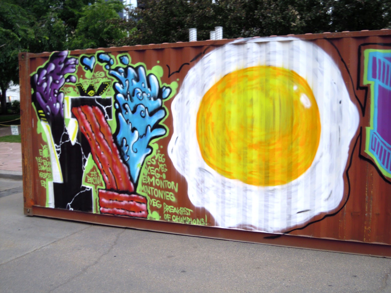
A big steel Sea-Can container painted in collaboration with En Masse at The Works


Greetings homies! Over the last couple of days I had the chance to collaborate with the skilled fellows from En Masse out of Quebec. They were in town to paint the archways at The Works, an annual festival in downtown Edmonton, and asked a few local artists to help out. We collaborated on the archway, which they'd made a solid start on before I got there, then the next day painted a large Sea-Can container. Sea-Can containers can be a bit tough to paint because of the deep ribbing of the steel surface, so we went big and all aerosol on this one. I had a great time painting and chilling with Fred and Jason of En Masse, they're some chill cats with serious illustration chops and creativity and they're great ambassadors for street art as well. 

En Masse's group mural style is almost entirely freeform; each artist paints whatever they want off the top of their head with little or no predetermined concept or order, almost always in black and white. This leads to a lot of interesting combinations and makes for some striking visuals as the ever changing memberships give En Masse's overall aesthetic a very dynamic feel that still somehow fits under one banner. On the last day of their stay, Jason decided to go for some bright colours to spice up the Sea-Can. Fred and I were mad hungry when we started painting, so I rocked some giant bacon and he came through with a sunny-side-up dinosaur egg. Word. I was also lucky enough to get a little exposure out of the whole thing, as the Edmonton Journal showed a shot of me painting a big robot for their piece on En Masse. Shoutouts to  Jason and Fred, Real, Carmen, Fish Griwkowsky, and the other painters, Jocelyn Hajash, Jess Fleury and all the volunteers at the Works, and everyone else that came out to kick it!

Saturday, June 16, 2012

Bikeologification

Bikeology (36x48in, aerosol on canvas, 2012)


Aloha! What's crackin? This is a piece I painted live a few hours ago during 2012's Bikeology Festival up here in Edmonton. I had about 4 hours to set up and paint it, and wanted to create something loose, full of motion, and funky that reflected the energy of the festival, so I basically just freestyled it on the spot. This was the festivals 11th year in a row (and it's only rained once! mother nature has their back) and it was hella good time. Bikeology is a local, annual festival that celebrates the invention of the bicycle, often with an emphasis on more sustainable urban transportation in general. I can dig it. There were some dope musical performances this year, including Politic Live and Quordal Fusion (who smashed it!), and some crazy bike related activities are open to the public every year — all the audio equipment for the music is actually powered by people on bikes attached to generators, which are set up by Music is a Weapon (a rad local social enterprise). You can also blend your own smoothie using only bike power, and you can roll through and get your bike doctored up by an expert bikeologist. Props to Carly and the rest of the team that put the event on, and shout out to my man Jesse for the linkup! 

PS. So far I've had some seriously amazing responses to the contest from last post — thanks so much everbody, and keep 'em comin'!!!

Friday, June 15, 2012

Broken Arrow / Contest

Broken Arrow (36x24in, aerosol on canvas, 2012)


Yo! Whats good? Here's the most recent commission from the Singularities series, which I finished and delivered late last week. I had a lot of fun with this piece, and a lot of thought went into it as well. I was planning on explaining all of the inspiration and thought patterns behind the work in a verbose & long-winded blog post, as usual, but I'm way more curious what it makes you think of. Shoot me an email at ajalouden@gmail.com with 'Broken Arrow' in the subject line, and tell me what you're looking at up there! Don't be shy, say whatever you're thinking, and be honest! Whoever has the most thought-provoking or hilarious or most original response will receive a mystery painting, courtesy of me. Get at me!! 

**contest ends july 15 2012**

Wednesday, June 13, 2012

Al Fresco 2012

Superfresh (aerosol and rain on canvas, 2012)


(halfway through)


(original sketch)


Greetings homies! Above is a piece I did last Saturday at the Al Fresco 104th St Block Party, along with a shot at about halfway through and the thumbnail drawing I brought as a sketch. This year the block party was raising funds for Zebra Child Protection Centre, a child abuse response centre, among other things, here in Edmonton. The event went really well for the most part, but ended up getting rained on something fierce — it was a big challenge to finish all the fine detail work to finish as aerosol and rain aren't that friendly, but it gone done! Bid on my piece (#81) or any of the other rad auction items right here — 100% of the proceeds go to the Zebra Child Protection Centre. My man Danskee did a super sick stencil too! I also happen to be graduating tonight from a 3-year design program here in Edmonton, and although it's good to be done, I've been in school forever (I studied several '-ology's before choosing design school), so it's been a trip figuring out this whole 'real world' business. I was lucky enough to do an internship recently at the Alberta Gallery of Art with the design/marketing team, including the chillin' villainous design mastermind that is Clay Lowe (a sick designer, artist, and all around rad dude), the slick hustlin' monster wrasslin' Josh Holinaty (The thugged-out illustrator, you ask? Yes, indeed!), the fly friendly force of fashion that is Janis Galloway (of Dressmedearly.com fame, who also happened to organize the fashion show at Al Fresco), as well as a big roomful of other really great folk. After the internship I was hired on for a few weeks to help finish a couple big projects I'd been working on, including a bunch of signage design, some form building, and rebuilding a layout system for an important multipage semi-annual. I learned a ton, and am super grateful to everyone at the AGA for the opportunity and the positive experience! Since then I've been busy with some freelance design work, a bunch of commissions, and getting ready for a summer camp I'll be teaching next month — but more about that later! Thanks a ton for coming through, and I hope to catch you soon!

Monday, May 28, 2012

Hit 'em in the Rooftop Chakra

Rooftop Chakra (watercolour, india ink, chalk, digital, 2012)


( some of the process behind the piece)


What's crackin?? This piece was inspired by the idea of a paradigm shift — an intense moment of enlightenment through which we radically change our outlook on the world. The city at the top of his head, at his crown chakra, is a metaphor for the world of thought borne within. This city of thought is being dramatically restructured by a blast from above as homie gets his mind blown, energy being routed through his crown chakra on into his third eye. The city is demolished, only to be rebuilt to the standards of a new perspective, a fresh world view. 

A reworking of a project for a class I took earlier this year, this was a foray into a style of digital collage that is still relatively new to me, so a lot of time was spent fiddling with the colour saturation and image definition in Photoshop — the time spent on the execution of this piece was probably about 50/50 between traditional and digital media, but I learned a ton of things that streamlined my workflow, and will likely lead to more exploring of this kind for my illustrations in the future. The buildings that weren't drawn were cut out of magazines, scanned in, and then altered and imported using Photoshop, and the face is composed of elements of my own, along with my homie Colton Ponto's rad, thuggy beard. Also, shoutout to my man Sam Williams, the illustrator behind The Sky Press, for providing me with a few simple but key tricks last time we linked up. Word. Thanks for rolling through and checking this out, and may your future be full of profoundly beneficial paradigm shifts! Peace, homies!

Monday, May 21, 2012

Hip Hop in the Park 2012: Battling with the Elements


Hip Hop Loves You (8x4ft, aerosol on board, 2012)


Good day! What's new? Hip Hop appreciation week was last week - I was lucky enough to be a big part of a few of the events leading up to the fifth annual Hip Hop in the Park, and last week was sooo dope!! I painted live at an art and fashion show two saturdays ago (see my last post), judged a freestyle battle as well as a production battle on tuesday, painted live at a Turntable Choir on thursday (see the piece above), and again at Hip Hop in the Dark on friday night.  Every element of Hip Hop culture was on display throughout the whole week, but the weather ended up being a huge element too! Luckily, Hip Hop (and Bruce Lee movies! Jeah!) can teach a lot about how to play it by ear and how to freestyle, finding resilience in flexibility and the ability to adapt. The piece above was painted for the Turntable Choir presented by Hip Hop in the Park, which was a really fresh event that involved several local DJs and producers kicking beats collaboratively. This piece was a huge challenge to paint due to the wind and the temperature - at the beginning, it was all good, but as the night wore on the wind picked up and started blowing the board along with the heavy metal easel right to the ground! Using aerosol paint in wind like that is definitely no cakewalk either... Luckily, for a few stretches my homie Mo as well as my man DJ Budakron, who organized and MC'd the event, hooked a brother up and held the board steady against the cold winds (Thanks homies!). This piece was auctioned off at the show, and after a fair bit of back and forth, it went to my dude KazMega, an ill local MC and beatmaker - check out his video by clicking right here. 


 (photo credit: the fisheye of my man nutly from nutly.net)

Hip Hop in the Park 5 was blessed with a beautiful, sunny day, but the wind definitely threw down a little as well. The piece you see being created above was a banner for Rellik, a musician from around the way, who saw me painting another piece earlier in the day (which sold at the festival - I'll probably feature it in another post if I can get some quality photos of the final piece) and commissioned me to quickly paint his show banner. He had it tied to the fence, and it seemed fairly taut, but when I started painting it the wind rolled through and made things mad tricky. Basically, I ended up having to paint a moving target, as this banner was billowing in and out at least a foot almost constantly. I really wish I had it on video, because it would probably be hilarious to watch me dodging back and forth trying to paint this thing as it whipped around in the wind. Somehow, I managed to make the paint stick mostly where I wanted it to, and Rellik was stoked with his new show banner.

I'm pumped that making both of these pieces work amidst unfavourable circumstances ended up being possible - there are a few little details I'd loved to have been able to touch up, but for the most part I'm happy with the results. This year's Hip Hop in the Park was easily one of the best yet, and the graffiti section pulled out some serious heat!! I'm proud to say I helped organize it. Until next time!

Tuesday, May 15, 2012

HHITP: Passion for Fashion

Passion For Fashion (8x4ft, aerosol on board, 2012)
 (Photo credit: the fisheye'd Iphone camera of my man Nutly from Nutly.net, and Deep Blue Photography for the other two)


(my initial sketch)


Greetings! I'm back with a quick update after the Hip Hop in the Park Art and Fashion show last Saturday at the Remedy Cafe. The event was a hella good time, and the house was packed! I showed a few pieces alongside Jenn Kovachik, who kills it on the regular with her portraits of Hip Hop's legends, and Lorien Maheu, whom I've shown with on several occasions before, and who's laying down an ill impressionistic surrealism of sorts at the moment. Big respect! There was superfly fashion all on display from the multi-talented Lady Venz, Solidaritees, and many others. We were also lucky enough to have DJ Baggy Lean on the wheels of steel, mashing the place up with classic and new tunes. I also painted a piece live during the event, which took about 4.5 hours. I'm happy to say that the piece was sold at the event, with 100% of the proceeds going to support Hip Hop in the Park, and since this year is shaping up to be the biggest, baddest-ass HHITP ever, a few hundred extra dollars in the bank definitely helped out! Shoutout to Melissa La Bishop and the rest of the HHITP crew for putting together a dope event, and nuff love to the folks at the new Remedy Cafe for their hospitality!

Saturday, May 12, 2012

Back from the timewarp!

Malcom X and MLK Armwrestling as Observed by C. Delores Tucker, Tupac Shakur, Fred Hampton and Marcus Garvey (12x12in, acrylic on canvas, 2012) 


Yo!! Where have I been for the past like 3 months, you ask!? Obviously I was stuck in an epic time warp. Don't worry, I stayed busy painting while I was in there, and came back with some work to show. This first piece (above) was my submission for the group wall at the 5 Artists 1 Love show at the Alberta Gallery of Art in February. The phrase we were inspired by this year was 'Civil Rights Movements'. I chose to depict the dialectic creation of a collective black identity. The show was a smashing success, and the work was shown on Global and Breakfast TV, along with myself and a couple of the other artists fielding questions about our work.


Hammertime: Prototype (8x10in, acrylic on canvas, 2012)


If you've been checking out this blog for a while, you know I'm super down with robots. This is a hammer slammer robot I made up and painted a little while ago after seeing at a bunch of Warhammer stuff. He's slightly malfunctional, as evidenced by the bent nails all around him. Step your game up, robot homie!! It's cool though man, you're just a prototype, we'll get that worked out back at the lab. I did a couple other instalments in this series, but this has been my favourite so far. 


Tariq (60x48in, aerosol, 2012)


Here's a commission I completed a few weeks ago - this photo was taken just before I finished. I've since added a few tweaks and cut into the bright green with some photo-luminescent paint, meaning this piece has some serious pop with the lights out! 


Lastly, a couple more yet untitled additions to the Singularities series - I'm not sure if I'll be adding to these two or leaving them alone, but I like where they're at and figured I'd share them. Thanks for checking in! If you're in the Edmonton area, I'm painting live tonight at a Fashion and Art show put on by the fine folks behind Hip Hop in the Park, come check me out at 10279 Jasper ave starting at 7and going till 11pm. Word!