Friday, January 27, 2012

Singularities


Desert of the Future (acrylic, aerosol on canvas)


Untitled/Mushrooms (mixed media on canvas)


Yo! Here are a couple pieces of the pieces I'm showing for the first time at the Finesse Home Living gallery (4210 Gateway Blvd) here in Edmonton, starting Feb 1st. They're part of a series that is a proposition on the potential aesthetics of a singularity event - come check out the show to see more of what I've been up to, I'm really proud of this series and the new directions it represents! I've just recently finished up with a few big parts of the March for Understanding campaign for the Centre for Race and Culture, and have submitted my piece for the Wall at the 5 Artists 1 Love show at the AGA this year, and am having another piece framed by my lovely and ever supportive girlfriend Leah just in time for the show! Stoked! See you next week!

Saturday, January 21, 2012

African-American Express


African-American Express (watercolour and acrylic on paper)


Greetings!! I'm back again to get it crackin' with a quick piece that came out of one of my classes last semester. Our assignment was to illustrate a lyric - I chose a part from Kanye's 'Last Call' from the album College Dropout, where he's talking about being at the mall blowing all his money and being approached by a girl asking about his credit card.
The song goes like (or click here to go listen to it, the lyric drops at 3:12):

Girl at the Mall: "Oh my God, is that a black card"
Kanye: I turned around and replied "Why yes, but I prefer the term African-American Express".

A black card is the highest limit American-Express credit card, available by invite only. I think this lyric is a succinct and interesting example of Ye's work to redefine the Black image in popular culture, and it spoke to me on a variety of levels. I chose to take a very literal approach in illustrating it because I thought the lyric itself had many layers of meaning, and I wanted to showcase the content already inherent. For the most part I was fairly happy with the execution on this piece, but the typography, which is usually not one of my weaknesses, fell apart a bit in a few places. I also took the opportunity to bump up the contrast a little digitally, which I think helped the overall impact. Thanks for coming thru, and shoutout to Yeezy for the fresh lyric!

Wednesday, January 18, 2012

Stressin'


Don’t stress homies, be easy! So… I probably need to take my own advice this week. I’m in my last semester of school, and as always am doing a ton outside of school, including a show at the AGA, a solo show at Finesse furniture gallery, this year’s Center for Race and Culture March campaign (including a big bus ad that I’m pumped about!), and a few other projects besides. Needless to say, I’m stressed! I created this series of digital illustrations for an article on recognizing and managing stress and its symptoms, and I definitely went through all three of these three responses to stress at least once over this week – I’m sure some of y’all can relate!
The first is referred to by psychologist Connie Lillas as the angry, agitated response to stress, and involves being heated up, overly emotional, and unable to sit still. I imagined this character getting all steamed up, and literally blowing his top. Another potential response to stress is a withdrawn or depressed response – here you shut down, space out, worry a ton, and let the stress drain your batteries. The third most common way to respond to stress is a tense, frozen response. We literally ‘freeze’ under pressure and can’t get anything done – we seem paralyzed but under the surface remain intense and agitated. Here’s the original source for the article in case you want to find out about some of the ways to deal with stress http://www.helpguide.org/mental/stress_signs.htm . Me? I don’t have time to read that, I have way to much to do. Just joking. Check it out, there’s some good advice! Thanks for comin’ to kick it, and I’ll see you soon!

Tuesday, January 3, 2012

Catching Up


Yo! What's good! Welcome to 2012. I've got some serious catching up to do - I've been so busy working I haven't had a chance to make a post in a minute! Here's a mini mural I did for Ihuman's new home a couple of months ago, and finally got around to grabbing a few photos of. Ihuman is a really dope local organization that provides artistic opportunities for at-risk youth from about 12-24 - check them out at www.ihuman.org to find out more. They just moved offices and needed some fresh coats of paint, nah' mean? As always, I was more than happy to oblige. I've had the pleasure of meeting and working with many of the kids from the program and some of the work they produce is mad ill, I had to grip a piece last Artwalk along with a fly grey Ihuman hoodie. This piece lives in the stairwell that leads to the music studio downstairs, which mainly produces music in the Hiphop spectrum, and that's my ish right there. See you soon!

Thursday, December 22, 2011

Saturday, November 19, 2011

Puttin' In Work


Ride Dirty ( 8x10inch, acrylic ink, india ink, pencil and watercolour, 2011)


Salutations! Here are some things I've been working on. The piece at the top I finished yesterday, and is just a practice piece to get my typographic, compositional, and rendering skills tighter. They need more work! I'm not happy with the piece as a whole but I like some of the elements. The second image down is just a black and white version cause I thought it looked cool (maybe better than the colour version? you be the judge). The next two images are some of the process from a collaborative logo design over the summer - I took care of the calligraphy while my man Colin worked on the digital side and the rest of the branding. Lastly we have a wildstyle design for my man Jamie aka DJ AA. Wildstyle isn't my specialty, and this piece definitely still has a couple kinks to work out, but overall I'm pretty happy with the final feel. Catch you on the flip!

Monday, November 7, 2011

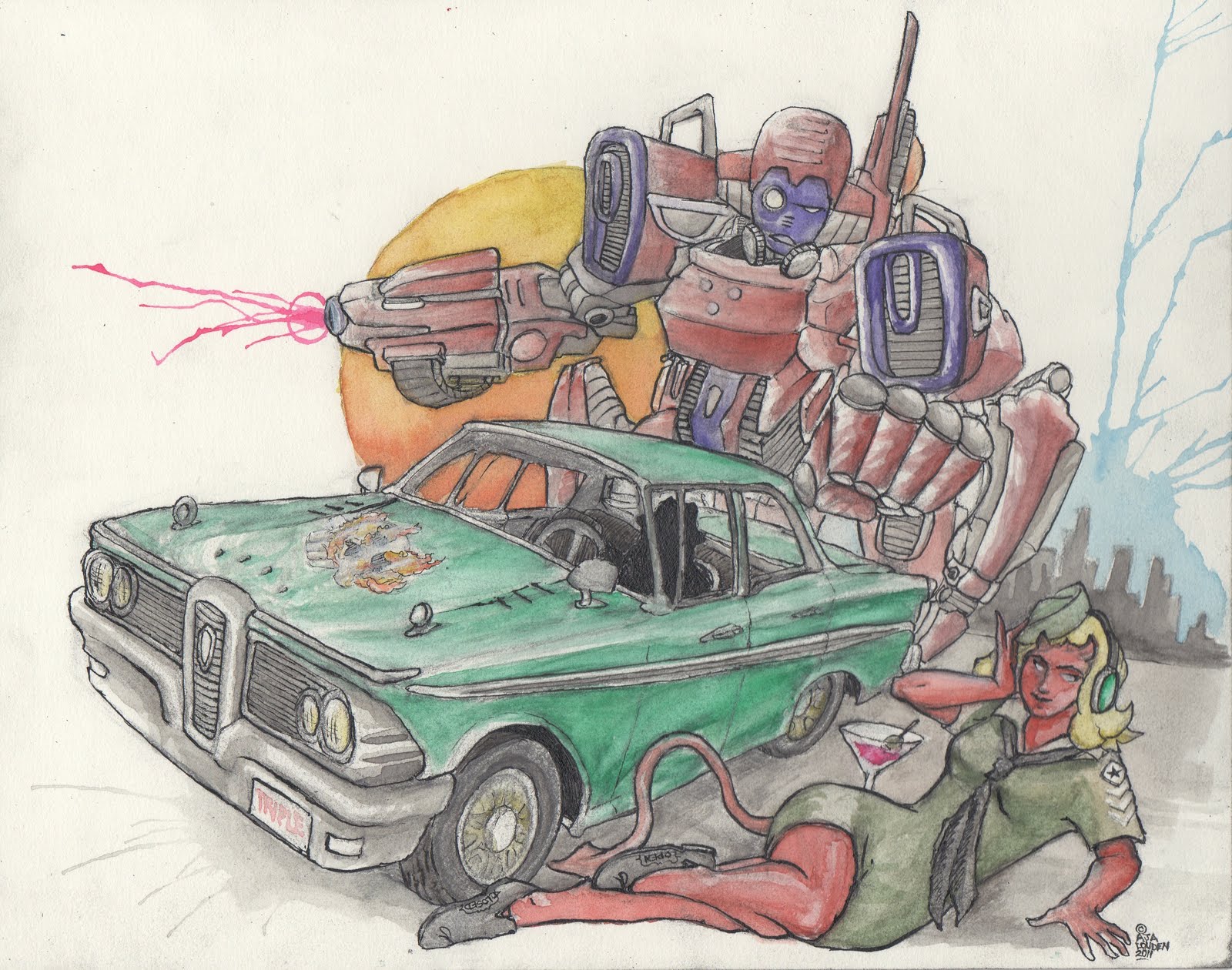
One Click, Two Robots.


Yo! Check it out - two large robots! One is flexin' his laser and showing off his Edsel with his devil-bot robo-spy girlfriend. I painted him between yesterday and today to get my watercolour style tighter. Still needs work. The other is made of spraypaint, and is also flexin' his laser, chillin' solo on the legal wall here in Edmonton. Straight blastin'. No big. I freestyled him today cause I was heinously unprepared and had random paint and no letters sketched, but I had a hella good time kickin' it and painting with the homie Billiam, and am still rather happy with how the robot came out. Blizzaoow!! (that's the sound of a laser. I made it a lot while painting both of these.)

Friday, October 21, 2011

Many Mouths, One Voice


Many Mouths, One Voice (watercolour & india ink on paper, 2011)


Truth To Self (watercolour & india ink on paper, 2011)


Two in a day?!? Damn straight. Here are a couple more pages from the beginning of my sketchbook. The one at the top, 'Many Mouths, One Voice' is a commentary on corporate control of the media, and I'll leave it at that. The second image, which is the second barbershop scene from my sketchbook, is called 'Truth to Self', and isn't quite done in the photo - I recently inked his face and the hand with the clippers, which I think added some much needed contrast within the subjects. Both photos have had the colours slightly rebalanced digitally because the scanner seemed to have trouble picking up the contrast and full range of colour - the 'Truth to Self' image still isn't quite popping the way it does in real life, so I think I need to iron out a few more kinks in my digitizing process before I post any more from this sketchbook. On to the next one!

Train Harder


Train Harder (watercolour & india ink on paper, 2011)


(original sketch)


Ayo homies! Here's another page out of my recently completed watercolour sketchbook - the first page in fact. A couple of posts ago I mentioned how I was placing bits of advice and inspiration for myself throughout the work, and here the message is to train harder. The sketchbook was mostly meant to tone up my watercolour, pen-and-nib, and hand-rendered typography skills, but ended up being a great place to study composition as well. I'm fairly happy with the overall composition and execution of this particular piece but by the end of the sketchbook (I ended up doing 21 paintings and 3 unpainted drawings in 2 weeks) I was more confident with contrast and colour choices, although overall this was still one of my favourites. Check back for more soon, and tell me what you think of the new style!

Thursday, October 20, 2011

Swim Good


Swim Good (8x10 watercolour & india ink)


Yo! How's things? Im back briefly with a little painting I did this morning, inspired by my 10,000th time listening to Frank Ocean's song Swim Good. I'm headed to the new Ihuman headquarters tonight to fancy up one of their walls, so I'll be back on the quick to post that... Word!