Showing posts with label edmonton artists. Show all posts

Wednesday, October 17, 2012

Portraits

Geordie LaForge (approx 8ft x 7ft, aerosol on wall, 2012)
(photo by the homie Nutly)

(in progress)
(photo by Nutly)

What's crackin? Here are a couple aerosol portraits I knocked out over the weekend up here in Edmonton. Above is a portrait of LeVar Burton as Lieutenant Commander Geordie LaForge from Star Trek: The Next Generation that I painted last sunday. You already know I'm a nerd like that. I chose LeVar Burton because he was one of the cats I looked up to as a kid. His character Geordie on Star Trek: TNG was unlike any other Black character I'd seen on TV — well-respected, tech-savvy, professional, and an integral part of the team on the Enterprise. What a boss! I'm proud of how this piece came out; I've been working hard on my portrait game, but this one was definitely a challenge, especially with a bit of wind and limited colour selection. By no means did it end up perfect, but I feel like I'm getting better! 

 Lots of people have been asking me lately if I use stencils or markers or an airbrush or anything like that, especially for the more realistic looking stuff — just to set the record straight, it's all free handed with spray paint only, it's more just about practice, thinking in layers, and understanding the medium. The LeVar Burton portrait took me about 5 hours to paint, and the one below took me about three and a half.


 Portrait Demo #1 (8ft x 4ft, aerosol on board, 2012)
(photo by Tiffany aka Zombiffany)


(in progress)
(photo by Maigan van der Giessen)

The black and white portrait above was created for an aerosol demo I did at Colours Art & Supply on the south side here in Edmonton last Saturday. The piece iteslf will be moving between Colours art stores, likely every few months. I learned a lot while doing both of these portraits, hopefully conveyed some knowledge, and happened to get a lot of props from passers by as well — thanks for all the love Edmonton! 


Friday, September 7, 2012

Seasons Change

 Sara's Piece (2012, aerosol, acrylic, and ink on canvas)

Sara and her mom Lianne with their new piece.

Yo! Here's a piece I put together for as a commission last month. Sara wanted a large piece, a portrait, so we decided to do it in the style of my Research on Control series. I took a few liberties and experimented with the colour palette in the portrait a fair bit, and am happy with the results — I learned a lot doing this piece, and have another top-secret acrylic portrait thats been in the works for quite some time coming soon...


Rock the Rails 2012 demo piece

So I've spent part of my summer designing a program, called the Aerosol Academy, to teach youth about the history, cultural relevance, and legalities of graffiti. Using a custom workbook, they first learn about the history of the art form, then get to try out some of the tools and techniques, first on paper, then on canvasses or boards. At the end of the program, we again review the legality of graffiti — what it's legal for them to paint on and what they'll probably get in trouble for, and where the nearest legal wall is, or how to get one set up. At Rock the Rails last month in Leduc I introduced a super condensed version. Here's how it went...

Rock the Rails 2012. After running around all morning getting supplies for the Aerosol Academy Mini Camp, I get to the site at around 2 pm. It's nice and sunny out. I start prepping all the boards with basecoats and setting up the easels. Around 4:00, the wind picks up. Hella. We start putting everything away, and a big section of the sky turns green. Everyone starts taking pictures cause it's so freaky lookin. Then, intense lightning and thunder. Everyone runs to their vehicles and GTFOs. Intense hail and winds for like 2 hours. Then all of a sudden, at like 7pm everything clears up and it's all good, Rock the Rails 2012 skateparks competitions are delayed, but the Battle of the Bands is good to go, and the bands start to throw down. Kids start signing up for the Aerosol Academy, and I start giving them plastic jumpsuits, a quick walkthrough of the mini-workbook, and cans of spraypaint, then pointing them at 8'x4' sheet of plywood on easels. Other youth come over and check it out. More kids come with consent-form-signing parents in tow. I largely ignore the demo piece (above) I'm trying to paint as I'm too busy signing kids up. And stopping them from trying to figure out whats wrong with the nozzle by staring into it and trying to spray. The plan was definitely to do something a lot more structured, but considering it was hailing out half an hour before, a little rolling with the punches was required. Everyone had a great time regardless — we actually ran out of boards to paint on, and could have used more paint too, so despite the intense weather and tight timing, the event was hella successful! I wish I had some more time to finish the demo piece I did (shown above), there are definitely a ton of things I would have like to clean up, but it's all good. Congrats to Smile for the Bullet who took home the top prize in the Battle of the Bands!  


 Untitled (diptych) (2012, aerosol, housepaint, acrylic)

Lastly, here's a diptych I painted for my mom while I was down in Calgary for the long weekend. Seasons are changing where I live, and that's what these paintings are about. Aiight, thanks for coming by homies! I'll be back again to get it crackin' soon. 


Friday, August 31, 2012

Shame on me!

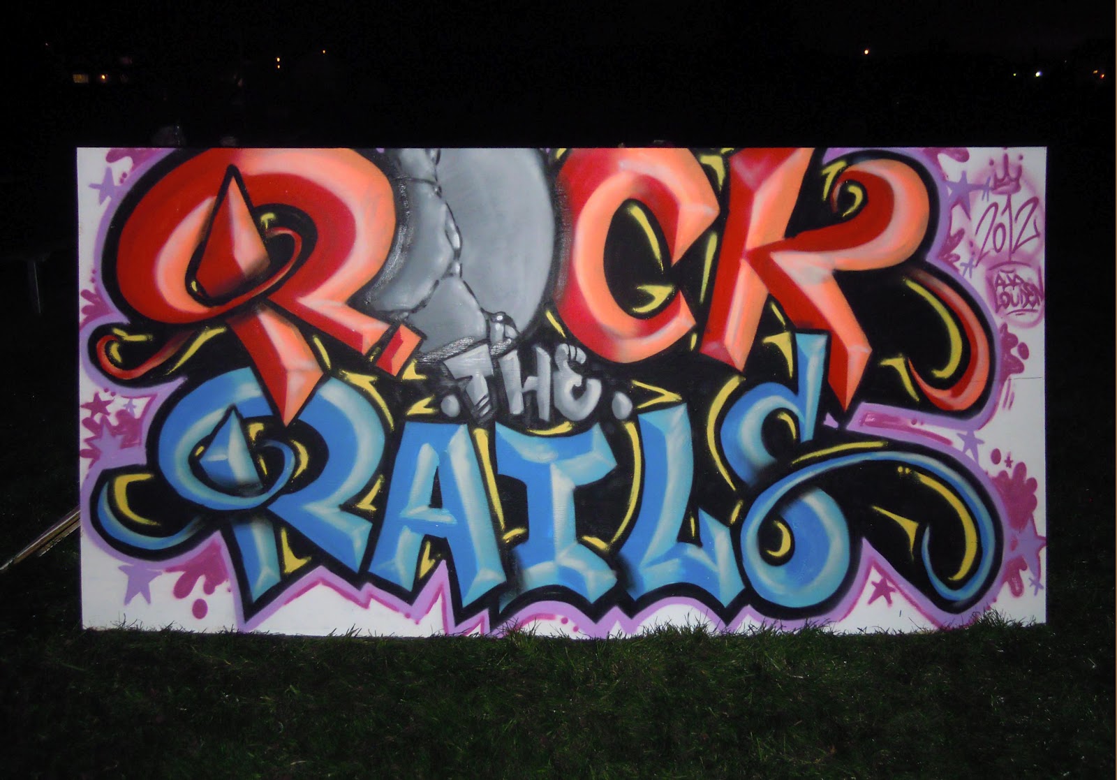
Twerk Laser (12x12in, aerosol on canvas, 2012)

Ok — shame on me!! Leaving for so long without a single update, without even announcing the winner of the Broken Arrow contest!? Ridiculous! To be honest, I haven't been feeling great for the past while, but that's definitely no excuse. Well, now that we're here, onwards to the Broken Arrow contest results! The mystery prize, Twerk Laser, can be seen above. Please give it up for the winner, one Alex Ross of Calgary, Alberta, Canada. This was actually a hella tough decision. I was lucky enough (thanks so much everyone!!) to get a ton of thoughtful, well articulated, original and insightful submissions. I was totally overwhelmed by both the number and quality; I was driven into the lab like a madman wanting to create more work, stronger work. Alex's submission got the win because it was poignant and concise (something I often struggle with in my own writing), and powerfully honest. It gave me a totally new perspective on Broken Arrow, and the Singularities series in general, and how it could be read. I really want to thank everyone again for sending something in, I learned so much about the work I create through how you saw it. I've read all the submissions at least 9 or 10 times, some more, and so many people putting time, energy, and thought into their responses is seriously gratifying and hella motivating. Much love!

Broken Arrow (36x24in, aerosol on canvas, 2012)


I don't have room to share all of the submissions in full, but I wanted to share excerpts from a few of my favourites (I've left any minor spelling or grammatical errors in):


"...seems like a cave painting that was left in Neverland. A story that would be passed along almost as an urban fairy tale. Something that would be discovered post apocalypse. Where the street artists were the cavemen and the lost boys are us."


"Yo this painting gives me a reminder of my long struggle with addiction and alcoholism. The tan backround is the blindfold of alcohol and how little i see and enjoy in life when i drink, it seems calm and has the appearance to have a greater message, but it doesnt. The real joy and journey through life is along the arrow, with all sorts of colours representing balance in life. Too much of anything makes you an addict right, life is dull with only a few colours, too rigid and stagnant. I like how its got flow, still water stinks. I need to remind myself to always move forward and have variety. For me, my arrows been broken, split and gone all sorts of different angles. Each break in my arrow has led me places i would never had known exsisted that have made me a better person. So far, the arrow keeps goin, i just cant forget whats in my background or i might just be blindfolded again."


"To my eyes, I see some tags and graffiti on a wall somewhere that's been painted over (presumably by some social authority, suggesting all sorts of narratives about power and marginalized expression). The sharp lines and bright colors overlaying the the staid tan layer resemble the geometry of a circuit board, suggesting that digital tools offer a means of combating wheat colored repression. Most importantly, while the color palette revealed by the transformer-style circuitry is probably brighter and more saturated than it was prior to being painted over by the tan, it's not an entirely new palette. In other words, the tools of the digital age don't fundamentally alter the original expression, but increase its power and make it much harder to paint over and sweep under the metaphorical rug. All the oblique angles suggest that the circuitry is dynamic and growing... In other words, it's just getting started." (Snap, homie!!)


"It reminds me of what Jimmi Hendrix would see while tripping out on acid while doing a live show."


"I get an almost Native American feeling from the brown and tan colours in the piece, tagged "thieving s(w?)ine" as if in retort for the land that the white man has stolen from them, and indirectly created the art form that is being used to create the piece itself."


"The first thing that stands out to me is a theme of chaos among order; specifically I immediately noticed that although most of the 'circuit' lines seem to follow a clearly defined path/pattern, there are a few that are not entirely parallel with their neighbors. The fist stands out next, representing to me resistance, rebellion and non-conformism. The overall design is reminiscent of a circuit board and similarly-derived themes (e.g. Tron), signifying transmission of information and automation of calculation - building blocks in human advancement. Bland foreground colours with bits of words I can't make out are reminiscent of Soviet-era opression, and I imagine a cicuit-shaped Band-Aid being ripped away to reveal the bright, colourful existence that lies beneath - the future. Perhaps this suggests that it is communication/transmission of information that is the vehicle in beginning the dismantling of oppressive regimes. Although the circuit lines in the top right are still composed of straight lines, they are some of the only angles in the piece that are obtus (greater than 90 degrees), making them seem nearly organic compared to the carefully structured other lines. It almost looks like an eagle's wing to me, symbolizing liberty/freedom. The location of this 'wing' so close to the defiant fist further suggests rebellion/defiance for the sake of freedom from oppression."


"What I see in it is essentially the growth and evolution of consciousness.  It's always there, but only can be tuned into on certain frequencies, rhythms, and codes.  Everywhere that has not been transmitted into it is still there (the tan, textured background), just not nearly as vibrant or soulful as the rest of the environments or entities that enable consciousness.  It's almost as if it is there, but after it's searching for patterns, or ways to organize itself, the consciousness reveals that it's really just created it's own pattern of consciousness in the process." (Deep!)


"When I look at this painting, I can't help but feel pumped. Like, as good as you feel when you win a contest. Yeah, that's exactly it. It makes me feel like a winner. Of contests. The bright colours and sharp lines that really solidify that for me, they have the same internal energy made even more invigorating but also anxiety inducing by the neutral yellow that is quite predominant in the piece. Although it's not completely neutral, so sorta like when someone first tells you about a contest and you get visibly excited but you don't want to get fully excited like you just know that if you get your hopes up that it'll really suck when you don't win because it'd be the best feeling ever to win without a doubt, the best ever, and your trepidation shows but it what truly it shows is that you're not letting yourself fully feel your inner, lurking, more excited excitement in anticipation because you're pretty sure you're talented and funny and attractive enough to win. The painting shows that though. The inner stuff." (this made me laugh so much! and relate)


"Looks like the airport at Area 54 with the desert floor in the background and the CIA's idea of camouflage on the runways."


"The vertical lines that taper off in a 3D skyline type of a way at the top, and are decorated with billowing banners and a fist (representing glamour and power respectively), portray the current rap major labels, the Def Jams, Cash Money, Aftermath ect., and, compared to the surroundings, its the most interesting thing happening by far. I can't really begin to accurately guess what the lettering behind or in the building actually says, but for my purposes, I'm seeing that as reading something close to "Thieving Inc.". That green script inside the tower might read "Evil" though too, that could work.. Anyways, its got the semi official lookin circular stamp shape encircling the towers, so it all represents the industry in my eyes. Everything about the lines has a very high-tech feel to it, like circuitry, which is appropriate because the commercialization of the Hip Hop culture has always been very much based on technology; be in cassettes, CDs, or now MP3s (and headphones), the big leagues were/are making most of their skrilla off of selling the actual plastic the music was printed on, not the music. It's the reason that the industry is having trouble making money now that no one wants to pay 14 bucks for a piece of plastic that cost the company 2 dollars, of which 1 dollar  actually went to the artists pocket. But that's another rant..."


My man Doobyis also recorded a fresh track called The Breakthrough as a submission — check it out after the jump! Thanks again for coming thru, and a big big-up goes to all those that had a chance to submit something to the contest. I'm in Calgary over the weekend but have a TON of new work to share once I get back — no months-long hiatus this time, I promise! 

Monday, May 28, 2012

Hit 'em in the Rooftop Chakra

Rooftop Chakra (watercolour, india ink, chalk, digital, 2012)


( some of the process behind the piece)


What's crackin?? This piece was inspired by the idea of a paradigm shift — an intense moment of enlightenment through which we radically change our outlook on the world. The city at the top of his head, at his crown chakra, is a metaphor for the world of thought borne within. This city of thought is being dramatically restructured by a blast from above as homie gets his mind blown, energy being routed through his crown chakra on into his third eye. The city is demolished, only to be rebuilt to the standards of a new perspective, a fresh world view. 

A reworking of a project for a class I took earlier this year, this was a foray into a style of digital collage that is still relatively new to me, so a lot of time was spent fiddling with the colour saturation and image definition in Photoshop — the time spent on the execution of this piece was probably about 50/50 between traditional and digital media, but I learned a ton of things that streamlined my workflow, and will likely lead to more exploring of this kind for my illustrations in the future. The buildings that weren't drawn were cut out of magazines, scanned in, and then altered and imported using Photoshop, and the face is composed of elements of my own, along with my homie Colton Ponto's rad, thuggy beard. Also, shoutout to my man Sam Williams, the illustrator behind The Sky Press, for providing me with a few simple but key tricks last time we linked up. Word. Thanks for rolling through and checking this out, and may your future be full of profoundly beneficial paradigm shifts! Peace, homies!

Monday, May 21, 2012

Hip Hop in the Park 2012: Battling with the Elements


Hip Hop Loves You (8x4ft, aerosol on board, 2012)


Good day! What's new? Hip Hop appreciation week was last week - I was lucky enough to be a big part of a few of the events leading up to the fifth annual Hip Hop in the Park, and last week was sooo dope!! I painted live at an art and fashion show two saturdays ago (see my last post), judged a freestyle battle as well as a production battle on tuesday, painted live at a Turntable Choir on thursday (see the piece above), and again at Hip Hop in the Dark on friday night.  Every element of Hip Hop culture was on display throughout the whole week, but the weather ended up being a huge element too! Luckily, Hip Hop (and Bruce Lee movies! Jeah!) can teach a lot about how to play it by ear and how to freestyle, finding resilience in flexibility and the ability to adapt. The piece above was painted for the Turntable Choir presented by Hip Hop in the Park, which was a really fresh event that involved several local DJs and producers kicking beats collaboratively. This piece was a huge challenge to paint due to the wind and the temperature - at the beginning, it was all good, but as the night wore on the wind picked up and started blowing the board along with the heavy metal easel right to the ground! Using aerosol paint in wind like that is definitely no cakewalk either... Luckily, for a few stretches my homie Mo as well as my man DJ Budakron, who organized and MC'd the event, hooked a brother up and held the board steady against the cold winds (Thanks homies!). This piece was auctioned off at the show, and after a fair bit of back and forth, it went to my dude KazMega, an ill local MC and beatmaker - check out his video by clicking right here


 (photo credit: the fisheye of my man nutly from nutly.net)

Hip Hop in the Park 5 was blessed with a beautiful, sunny day, but the wind definitely threw down a little as well. The piece you see being created above was a banner for Rellik, a musician from around the way, who saw me painting another piece earlier in the day (which sold at the festival - I'll probably feature it in another post if I can get some quality photos of the final piece) and commissioned me to quickly paint his show banner. He had it tied to the fence, and it seemed fairly taut, but when I started painting it the wind rolled through and made things mad tricky. Basically, I ended up having to paint a moving target, as this banner was billowing in and out at least a foot almost constantly. I really wish I had it on video, because it would probably be hilarious to watch me dodging back and forth trying to paint this thing as it whipped around in the wind. Somehow, I managed to make the paint stick mostly where I wanted it to, and Rellik was stoked with his new show banner.

I'm pumped that making both of these pieces work amidst unfavourable circumstances ended up being possible - there are a few little details I'd loved to have been able to touch up, but for the most part I'm happy with the results. This year's Hip Hop in the Park was easily one of the best yet, and the graffiti section pulled out some serious heat!! I'm proud to say I helped organize it. Until next time!

Tuesday, May 15, 2012

HHITP: Passion for Fashion

Passion For Fashion (8x4ft, aerosol on board, 2012)
 (Photo credit: the fisheye'd Iphone camera of my man Nutly from Nutly.net, and Deep Blue Photography for the other two)


(my initial sketch)


Greetings! I'm back with a quick update after the Hip Hop in the Park Art and Fashion show last Saturday at the Remedy Cafe. The event was a hella good time, and the house was packed! I showed a few pieces alongside Jenn Kovachik, who kills it on the regular with her portraits of Hip Hop's legends, and Lorien Maheu, whom I've shown with on several occasions before, and who's laying down an ill impressionistic surrealism of sorts at the moment. Big respect! There was superfly fashion all on display from the multi-talented Lady Venz, Solidaritees, and many others. We were also lucky enough to have DJ Baggy Lean on the wheels of steel, mashing the place up with classic and new tunes. I also painted a piece live during the event, which took about 4.5 hours. I'm happy to say that the piece was sold at the event, with 100% of the proceeds going to support Hip Hop in the Park, and since this year is shaping up to be the biggest, baddest-ass HHITP ever, a few hundred extra dollars in the bank definitely helped out! Shoutout to Melissa La Bishop and the rest of the HHITP crew for putting together a dope event, and nuff love to the folks at the new Remedy Cafe for their hospitality!

Sunday, September 18, 2011

Hand Painted Dresser


Ayo, turn it up!


(before)

Whattup! Check out a couple photos of a project I just finished - remember Domino's mural from a few posts back? He had some cowboy-themed furniture in his room (above) that wasn't making the cut. No worries. I hand painted his drawers with speakers, sliders, and volume and effects knobs so that it would go along with the other fly stuff in his room. NBD. Awesomest bedroom ever. 'Nuff said.

Sunday, September 4, 2011

No Photoshop Required! YWCA Camp.


(Photo credit: Leah Erickson)
Whaaat!! Trippy photo right? It came out of the camera like this, no photoshop required!


The finished piece.


What's percolatin?? Here are some photos of a piece I painted yesterday at the YoWoChAs camp in Fallis, Alberta. I've had a great summer so far, and as part of giving back I donated some time to create a mural for the kid's camp. They wanted something painted on the netting in their archery range to liven it up a little, as well as to inform and remind people that the camp is YWCA sponsored. It took quite a bit of paint because the netting really soaked it up, but in the end with enough coats the colours really started to pop, and my lovely and talented girlfriend Leah took some crazy looking photos of the sun shining through the netting. Terry and the other fine folks at the camp, who were in the middle of leadership training, were mega hospitable, and say the kids will be super pumped when they show up for camp next week. Yeah!! On to the next one!

Thursday, September 1, 2011

Domino's Room


Bienvenue! Here are a few shots of my nearly finished latest mural - it's for a cool 7 year old whose nickname is 'Domino' - check it out! I'll be back soonish with photos of the furniture I'm custom painting for his room, it's gonna be so ill!! Thanks for stopping by!

Monday, August 29, 2011

Sneak Peek: New Paintings!


(detail)


(detail)


Yeah yeah yeah!! I'm back again with a sneak peek at the new work - I was trying to keep it under wraps until the upcoming solo show at Finesse, but I'm too stoked and have to give you all a lil look. I've been working nonstop on a new body of abstract work that has a much stronger focus on texture and patina than my previous work, and in short tries to visually elucidate the amorphous relationships between homo sapiens, technology, and the urban environment. This style is extremely time consuming and laborious, because it basically involves layering several paintings on top of each other and discarding the majority of each to make a single new painting. This stacking of layers as a process is evidenced partially as texture within the final painting, and perhaps makes a statement of its own regarding the structure of the aforementioned relationships. The photos you see here (more to come before the show!) are details of much larger works, and obviously aren't very efficient at capturing the texture or patina of the work, so you just gotta come to the show to really check it out!

Monday, June 13, 2011

Peanut Butter and Jelly


PB&J (8'x4' aerosol on plywood, 2011)


(original sketch)


What's crackin'? Here are some photos of the process and final product of the work I created at the 4th Street Al Fresco Block Party in Edmonton which was on Saturday the 11th. I donated this piece to be auctioned off later on that night to raise money for the E4C program, a charity which is currently raising money to make sure every kid has lunch at school. I chose to do a big peanut butter and jelly sandwich because E4C makes kids happy, and as a little kid I loved PB&J and the hundreds of variations (bananas and honey yo!) as a regular lunch staple. The piece was done on raw plywood for that extra-wholesome texture and flavour. The block party was hella fun, the beats dropped by Dane and Junior Brown had everyone going off, and overall it was a well organized event. Later that night was the premiere of the pilot episode of Tha Format alongside the HNL 5 bboy competition and art battle, but I'll save that for another post...