
Showing posts with label adrian louden. Show all posts
Showing posts with label adrian louden. Show all posts
Monday, May 2, 2016
Thursday, September 20, 2012
Walk & Don't Look Back

I'm The Toughest (R.I.P. Peter Tosh) (approx 8.5ft x 4.5ft, aerosol on billboard, 2012)
 The whole billboard about 3/4 finished
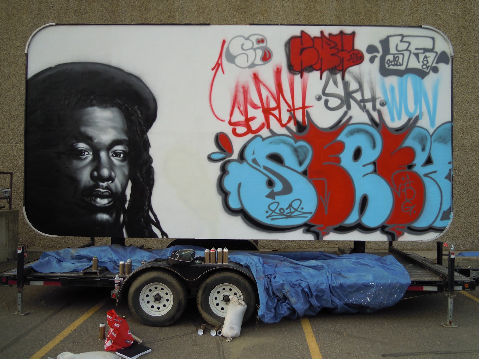
Yo homies! I've had an eventful week — on Tuesday I finished a mural along with Joker from Ihuman (see: last post) which is getting a little internet love, so far about 1000 likes on facebook and a ton of shares and comments. Jonathan, the main writer and producer we worked with on the project, is a hella cool guy, and let us do whatever we wanted on the billboard we were originally supposed to paint. I did a greyscale portrait of the Reggae legend Peter Tosh, and Joker repped his old graffiti name and crew. I'm proud of how the portrait came out, and although I still have tons of work to do on this area of my game, I'm excited to move forward and step it up! Peep this classic (and hilarious) video of Peter Tosh choppin it up with a wild-eyed Mick Jagger back in the day right here. Ok, that's it for today, I'm painting a pair of murals for Edmonton's The Creative Clubhouse tomorrow so I've gotta get myself sorted with supplies and that. Thanks for comin to kick it! One Love.
Monday, May 28, 2012
Hit 'em in the Rooftop Chakra

Rooftop Chakra (watercolour, india ink, chalk, digital, 2012)

( some of the process behind the piece)
What's crackin?? This piece was inspired by the idea of a paradigm shift — an intense moment of enlightenment through which we radically change our outlook on the world. The city at the top of his head, at his crown chakra, is a metaphor for the world of thought borne within. This city of thought is being dramatically restructured by a blast from above as homie gets his mind blown, energy being routed through his crown chakra on into his third eye. The city is demolished, only to be rebuilt to the standards of a new perspective, a fresh world view.
A reworking of a project for a class I took earlier this year, this was a foray into a style of digital collage that is still relatively new to me, so a lot of time was spent fiddling with the colour saturation and image definition in Photoshop — the time spent on the execution of this piece was probably about 50/50 between traditional and digital media, but I learned a ton of things that streamlined my workflow, and will likely lead to more exploring of this kind for my illustrations in the future. The buildings that weren't drawn were cut out of magazines, scanned in, and then altered and imported using Photoshop, and the face is composed of elements of my own, along with my homie Colton Ponto's rad, thuggy beard. Also, shoutout to my man Sam Williams, the illustrator behind The Sky Press, for providing me with a few simple but key tricks last time we linked up. Word. Thanks for rolling through and checking this out, and may your future be full of profoundly beneficial paradigm shifts! Peace, homies!
Tuesday, May 15, 2012
HHITP: Passion for Fashion

Passion For Fashion (8x4ft, aerosol on board, 2012)
(Photo credit: the fisheye'd Iphone camera of my man Nutly from Nutly.net, and Deep Blue Photography for the other two)
(Photo credit: the fisheye'd Iphone camera of my man Nutly from Nutly.net, and Deep Blue Photography for the other two)


(my initial sketch)
Greetings! I'm back with a quick update after the Hip Hop in the Park Art and Fashion show last Saturday at the Remedy Cafe. The event was a hella good time, and the house was packed! I showed a few pieces alongside Jenn Kovachik, who kills it on the regular with her portraits of Hip Hop's legends, and Lorien Maheu, whom I've shown with on several occasions before, and who's laying down an ill impressionistic surrealism of sorts at the moment. Big respect! There was superfly fashion all on display from the multi-talented Lady Venz, Solidaritees, and many others. We were also lucky enough to have DJ Baggy Lean on the wheels of steel, mashing the place up with classic and new tunes. I also painted a piece live during the event, which took about 4.5 hours. I'm happy to say that the piece was sold at the event, with 100% of the proceeds going to support Hip Hop in the Park, and since this year is shaping up to be the biggest, baddest-ass HHITP ever, a few hundred extra dollars in the bank definitely helped out! Shoutout to Melissa La Bishop and the rest of the HHITP crew for putting together a dope event, and nuff love to the folks at the new Remedy Cafe for their hospitality!
Wednesday, January 18, 2012
Stressin'


Don’t stress homies, be easy! So… I probably need to take my own advice this week. I’m in my last semester of school, and as always am doing a ton outside of school, including a show at the AGA, a solo show at Finesse furniture gallery, this year’s Center for Race and Culture March campaign (including a big bus ad that I’m pumped about!), and a few other projects besides. Needless to say, I’m stressed! I created this series of digital illustrations for an article on recognizing and managing stress and its symptoms, and I definitely went through all three of these three responses to stress at least once over this week – I’m sure some of y’all can relate!
The first is referred to by psychologist Connie Lillas as the angry, agitated response to stress, and involves being heated up, overly emotional, and unable to sit still. I imagined this character getting all steamed up, and literally blowing his top. Another potential response to stress is a withdrawn or depressed response – here you shut down, space out, worry a ton, and let the stress drain your batteries. The third most common way to respond to stress is a tense, frozen response. We literally ‘freeze’ under pressure and can’t get anything done – we seem paralyzed but under the surface remain intense and agitated. Here’s the original source for the article in case you want to find out about some of the ways to deal with stress http://www.helpguide.org/mental/stress_signs.htm . Me? I don’t have time to read that, I have way to much to do. Just joking. Check it out, there’s some good advice! Thanks for comin’ to kick it, and I’ll see you soon!
Thursday, December 22, 2011

Tuesday, September 27, 2011
Victory is Certain

Victory Is Certain (aerosol on wood, 2011)

(detail)
What's good?! I'm back really quick with a positive message - if you want it go get it. I was in my hometown of Calgary over the weekend kickin it with my brother, who's also on his grind doing what he loves, hence the message. Shout out to my lil' sis who's killin' it doin' her damn thing too! Let's get it fam!!!
Monday, July 25, 2011
R.O.C. - The Documentary
R.O.C: The Documentary
Whattup! Long wait, but its finally here! The R.O.C. Documentary was created by David N.O. as a school project about an artist, myself, getting ready for their first gallery showings at the TU and Latitude 53 galleries in Edmonton. The subtitle of Dave's project 'From the Streets to the Gallery' is a reference to the changing venue of one artist's work - graffiti artists create public art in the streets, and this documentary shows work born of that world ending up in the art galleries of the same city that used to arrest for it. I had a lot on my plate while this was being shot, between going to school full time, working, getting ready for two important shows, and trying to work on the documentary, and I think I seem a bit distracted throughout as a result, but hopefully for the most part I got my point across, if not always as articulately as I'd like. David N.O. from Dojo studios did a tight job of putting everything together - this project was his baby and luckily for me he is a talented and passionate individual. Dave did everything in house, from the original concept of the documentary to the filming to all the editing in post - the man has a well rounded game and a ton of vision. Check out his youtube channel if you'd like to see more more of his work. Also, major shoutout to DJ AA, also of Dojo, for the all original homegrown hiphop soundtrack. His beats knock. Ok, enough of this, enjoy the show!
Monday, June 13, 2011
Peanut Butter and Jelly

PB&J (8'x4' aerosol on plywood, 2011)


(original sketch)
What's crackin'? Here are some photos of the process and final product of the work I created at the 4th Street Al Fresco Block Party in Edmonton which was on Saturday the 11th. I donated this piece to be auctioned off later on that night to raise money for the E4C program, a charity which is currently raising money to make sure every kid has lunch at school. I chose to do a big peanut butter and jelly sandwich because E4C makes kids happy, and as a little kid I loved PB&J and the hundreds of variations (bananas and honey yo!) as a regular lunch staple. The piece was done on raw plywood for that extra-wholesome texture and flavour. The block party was hella fun, the beats dropped by Dane and Junior Brown had everyone going off, and overall it was a well organized event. Later that night was the premiere of the pilot episode of Tha Format alongside the HNL 5 bboy competition and art battle, but I'll save that for another post...
Thursday, June 2, 2011
Another Perspective Study

Yo! Here's another pen and ink perspective study - still not happy at all with the line quality or consistency of perspective, but I feel like it's getting better. More practice! I'm planning on hitting this with either some watercolour or going at it digitally, at which I have less experience. Should be fun! I have a lot coming up in the next few weeks - tomorrow (Friday June 3rd) I'm showing two pieces in Nextfest, an annual arts event at the Roxy theater, and I'm looking forward to showing the work, and seeing Kaz Mega preform later on - peep his latest video here. My favorite lyric is the one about Dragon Punching through life and making the new floor out of the old ceiling. Next weekend is the premiere of Tha Format, the Hiphop TV show I'm helping with, and the premiere is being combined with the HNL Bboy competition, which brings out ridiculous dance talent every event - for proof check out my homie Dave's music video based around the competition held earlier this year (the big dude with the orange shirt mashes it up fierce!). Also, on the 11th I'm participating alongside Curly and Danskee, two talented local artists, to help raise funds for an E4C program that provides lunches for schoolkids who can't afford them. Everybody's gotta eat!!
Sunday, May 29, 2011
Legal Dragon
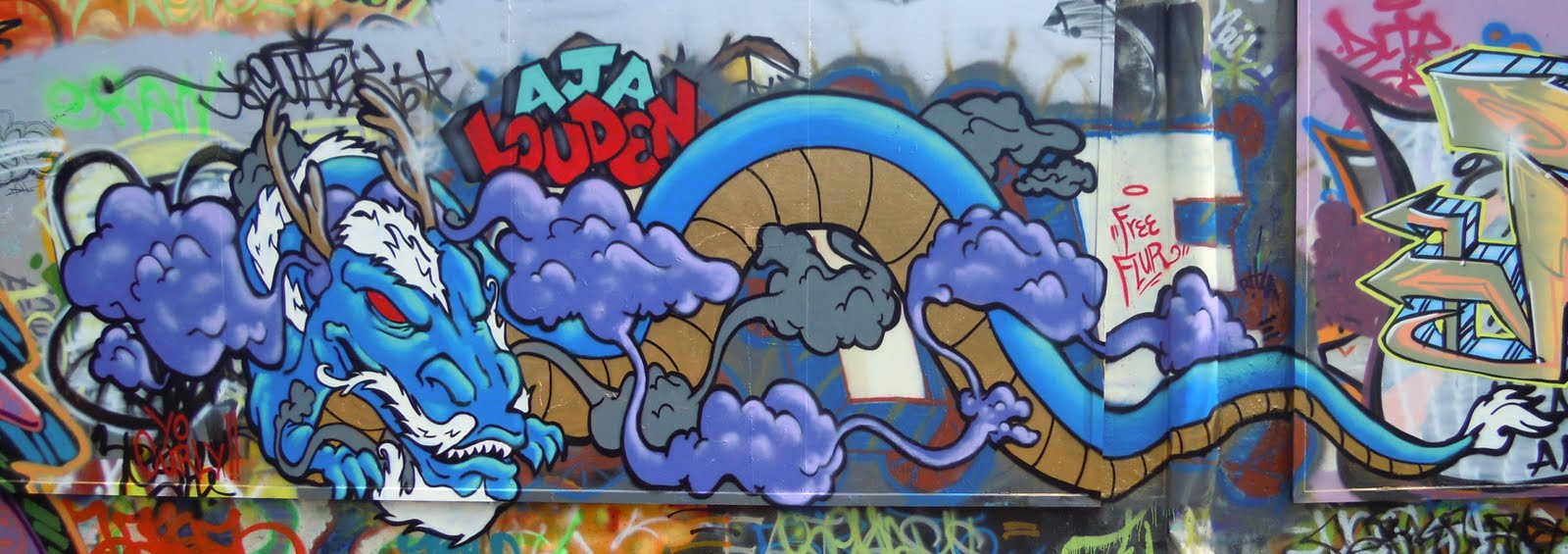 What's percolatin'?!? This is a dragon I painted here in Edmonton (Canada) on a free art wall downtown - anyone can come here and paint whatever they want. I think it's something the city has been fairly forward thinking on in terms of concept - the only problems are the area it's in is pretty seedy, which scares off a lot of kids who might want to do some art, and knowledge of the spot seems to be spread solely by word of mouth. I've had cops roll up all suspicious several times and start interrogating me because they themselves had no idea we were allowed to be there! A few awkward phone calls later things are usually cleared up. That said, I'm friends with a couple locals in the area and they are always mega stoked to see new art going up, and sometimes offer me a shopping cart to stand on if I'm trying to paint something really tall. My man Charlie, what it do!! Thanks for checking me out and catch you on the flip!
Tuesday, March 22, 2011
For those who missed the TU show

Curry Shark (10x8in acrylic on canvas, 2010)
Yo. Check this shark out, he loves curry somethin' serious! He and the other two paintings in this post were featured alongside the Research On Control series, Definitions of the Self, and another work, Urban Typographic Topography (who, due to a partially reflective surface, is hard to photograph and might not make it into the digital world), at the TU gallery show last month. The 's' doesn't stand for shark, and the white handwritten text denotes a few of the ingredients from an old shark curry recipe I found once.

The Prince (20x40in acrylic and aerosol on canvas, 2011)

The Prince (detail)
This work, entitled 'The Prince' (after Machiavelli's written work that was given to Lorenzo de Medici as advice on how to attain and maintain power), is a work that came together to represent a certain set of views on the concept of ambition. The painting is made up of symbols and references to stories about ambition, and contains a fair amount of text, all of which is written in Latin. The sword above the young stag's head is a reference to the Sword of Damocles, a tale from Cicero about a man named Damocles. He is a member of a certain king's court, and he admires and envies the king's power loudly. The king, to everyone's suprise, tells Damocles that he may take the throne. Damocles is of course overjoyed and accepts. Secretly, the king hangs a large sword above the throne by a single horse's hair, liable to snap at any moment, before Damocles ascends to power. When Damocles takes the throne and looks up, he realizes the king's lesson, and the moral of the story - "Heavy is the head who wears the crown", for power and success often make you a target, and to maintain it you must be ever vigilant, and true rest may not come easily. I for one don't take this as a warning against achieving success, but more advice getting one ready for the things that come with it. The crown floating just above the stag's head is a symbol of the power and success he chases - a young buck ready to fight for dominance of the herd and become the king, the trophy of the pack, and thus the target for every other stag in the herd, not to mention the hunters in the forest. As the stag gets closer to his goal, the crown, the danger of the sword becomes ever more relevant.
I chose to write the text in this work in Latin because I wanted to show how old of an idea this is, and also to some degree how esoteric. Like Latin these ruminations on ambition are ancient, and oft forgotten or mistranslated. On the sword is written 'mea maxima culpa', which translates literally to 'my greatest mistake'. This is what hangs over all of our heads, the one great mis-step we might make to send us tumbling down off of our achievements and rid us of our glories. Written all over the stag's body is 'vivat rex' which translates loosely to 'God save the king'. Between the stag's head and the crown is written the phrase 'ambitio virtute' which means the power or potential of ambition, the force drawing the young stag towards the crown, his audacious goal. The definition of himself that he carries written on his back is 'nemo tam ambitiosus', loosley 'no-one so ambitious'. This work means a lot to me, especially considering the struggles I have going on in my family life at the moment, thus the laborious explanation and somewhat tangled concept. It took a long time to paint - I had to brush up on some deer anatomy, and also partway through the piece I made a big mistake (a maxima culpa of sorts I guess) and had to restart from scratch, background included, which was pretty humbling. Actually, you'll get to see the whole process soon as the documentary that was filmed about me getting ready for the gallery show is almost done!

Military Intelligence (12x9in acrylic on canvas, 2010)
This is a painting I did late last year about war and is an attempt to express the cloudiness of boundaries, the fuzzy thinking and deceptive logic, and the confused and too often uninformed decisions that are made which cost millions of people their lives to the violence of war. I didn't mean this to be a condemnation of the military, which some people have taken it as, but as an attempt to illustrate the convoluted cycle of information and intelligence in war and its consequences, but I'm not sure I was successful - I think there are conceptual and compositional choices that could have been made more strongly, and the concept is perhaps too big for a painting that small, at least for me.

Poster and flyers for 5 Artists 1 Love show this year (never found out who designed them)
So, with the 5 artists 1 love show done, I've been keeping my focus on school, the documentary, and a couple side projects with friends, and getting ready for the next big event, which is Artwalk later this summer. I'm also thinking of applying to another local festival which is coming up called Nextfest, which could be a dope opportunity to show the work and try to communicate to a broader audience. Ok, well I'm out, so to once again take a page out of my homie Jarett's book, here's a link to your unrelated song of the day - right now life is giving me a couple lemons, and ain't nothin' make lemonade like some hiphop music, so peep this Atmosphere song.
Friday, March 18, 2011
ROC 5 detail

Research On Control #5 (detail)

Research On Control #5 (20x30in aerosol, acrylic and Krink, 2011)
Whattup? Here's a detail shot of ROC 5 and then the whole work for reference. This is the newest installment of the ROC series and I was happy to get the chance to show it at the TU gallery last month. One thing thats been inspiring me lately is a quote from Gary Busey, I saw it on that show Entourage one time. He says "Art is only research, it is not the final form." Brilliant.
Sunday, March 6, 2011
Definitions of the Self

Definitions of the Self (12x12in acrylic on canvas, 2011)
Yo! I'm back this week to show and explain the concept behind one of the works I showed at the TU gallery last month, 'Definitions of the Self' (click the photo to see it big). I'm proud of this piece because it communicates, which is what I've been striving for. When I found out that I had been invited to be part of the 5 Artists 1 Love show, the only restriction on content put forth by the curator, Darren W Jordan, was that each featured artist submit one 12x12 piece inspired by the words 'Black People', since the show was in February, which is Black History Month. To me, the phrase 'Black People' is a complicated one - it is used all the time in media and pop culture to describe a specific group of people, but the more I thought about it, the more I realized I didn't know exactly who that group was. Which is more relevant to membership within the group, the darkness of one's skin or how quickly someone can trace their ancestry to Africa or the Caribbean? Are albinos born in Africa still considered black? And importantly, who gets to decide what's 'Black' and what's not?
It seems to me that there are a lot of people attempting to define the group called 'Black People', and since I am counted within this group, I am especially curious about how it is defined in popular media, as these popular views are reflected on me, and have powerful impact on how others perceive me. The more I thought about it, the more I realized how potent this topic was. The work I created for the event was based on these ideas. I chose to use strong symbols because I believe they have a gravity that is appropriate for the weighty nature of the message. In the background, I first scrawled some racial slurs specific to Black people, then covered it over with white paint. These were and are used by some to define Black people, but where I'm from, these phrases have mostly been left to the past, although subtler and sometimes more dangerous forms of racism definitely still exist.
I then carefully scrawled the Oxford English Dictionary (6th Edition) definition of the word 'Black' onto the background. Dictionaries are usually seen as the official source for the definition of a word, and thus hold a lot of power in their ability to decide the semantics of, or 'shape of meaning' of any given word. Malcom X, a very important figure in the ongoing battle to define the qualities of Black people as a group, read the dictionary while he was incarcerated because he wanted to get educated. He came across the definition of the word 'Black' and was shocked when he realized the depth and power of the semantics involved. 'Black' is a word identified, according to the O.E.D. 6th Edition, as being associated in some form or another with 'distress', 'despair', 'anger or hatred', as well as being used to describe a specific group of people. Some may attempt to explain this away by saying these different definitions are not associated because they are used separately in different contexts, but Malcom X knew that this ambiguous definition had much impact on the perception (and self-perception) of Black people, and that these separate definitions had a subtle way of bleeding into one another. I tried to illustrate this through the way the letters connect to each other, pulling each other around the page, creating pockets of seemingly unrelated text, and making the definitions increasingly difficult to read as separate articles. I made a few small changes as well – I reversed the order of two of the articles in the definition for emphasis, and I changed the spelling of the word 'Coffee' to 'Coffy' in order to reference the movie I took the Pam Grier image from.
The final layer I painted, the two figures in the foreground facing off with shotguns, is a heated battle to define 'Black People' as a group. On the left is Pam Grier, famed Hollywood actress who first made her name by doing a series of influential Blaxpoitation movies. Blaxpoitation as a genre is important because it was really the first time in mainstream media where movies were being made largely by Black actors, directors, and producers for Black audiences, and thus had a huge influence on the popular perceptions of Black people, both within and outside the group. Black people were, for the first time, being cast as people in positions of power – taking control of their situations, defeating whatever oppressor was cast, and often dealing out heavy doses of social justice along the way, 'Coffy' being one example. Pam was primarily cast as a strong female lead throughout her career, and had a lot to do with defining Black women in the popular eye.
On the right, the other character with a shotgun is pulled from an old Warner Brothers cartoon called 'All That and Rabbit Stew', which apparently has been discontinued and largely covered up by Warner Brothers, although finding a clip from the cartoon is as easy as visiting Youtube. This character is an example of 'Sambo' style depictions of Black people - they have pale palms and their lips are light and massively oversized. This cartooning style has been used in the past to ridicule and denigrate Black people in popular media, and thus also played an important role in the definition of this group. After doing some research, I chose this particular example of Sambo caricature to add another layer of meaning because I found out that this character was inspired by Stepin Fetchit. This was the stage name of Lincoln Perry, who happened to be the first Black actor to get screen credit, as well as the first to make a million dollars, all from playing stereotypical roles of servitude and ineptitude to a largely white audience. There is some argument about whether he played these roles over-the-top with ironic intent, which complicates the symbol in an interesting way.
In the end, I'm trying with this piece to show that any group, not just Black people, has forces from the outside and within all struggling with one another for the power to define the group for themselves, and not have another's definition imposed upon them, because this definition of self is the basis of how we interact with one another and with society as a greater whole. 'Nah mean? Word. Thanks for stickin around, and hopefully I wasn't too long winded with this one - it's a complicated issue, and I'm still working on getting it figured out myself. Check back soon for the next unrevealed pieces from the TU gallery show!! Addendum: Peep this poignant song/video on a similar topic - it's called Brothers by Canadian rapper Shad, who is a genius.
Sunday, February 20, 2011
Lil Exposure
Wednesday, February 16, 2011
Musical Update
Hey! What's good? This is a time-lapse animation of the piece I did for Locution Revolution's LRT video last year (hit the fullscreen homie!) - they used the time lapse as a teaser for the video and the piece was a background for a big part of the video too. Big thanks to Nathanael J. Sapara for the photography and animation - good lookin' out chief!
This is the full video for Locution Revolution's LRT, one of my favourite tracks from these cats! It was a pleasure working on the video, and I was blessed enough to also exhibit alongside Khiry at the TU gallery show. Nathanael J. Sapara shot and directed this joint like a boss!
I have a few cameos in last year's Shiest - Props Pilin Up video too - check it out above. The guys asked if they could do some filming while I did the Guru tribute piece at last year's Hip Hop in the Park (check my July 2010 post) - peep for me around 1:30 and my art throughout the rest of the video. Shoutouts to my man Teagun who also shows up! I'll be back a.s.a.p with copies of the press from the TU and Latitude 53 gallery shows.
Saturday, January 29, 2011
Back off self-imposed hiatus, busier than ever! Life is good.

R.O.C. #5 - More details after the show!

Oni's Day Off (acrylic on Paper)

Shoutout to NesOne and DJ AA of the Bassheadz!
Let's get it!

A marker portrait of my friend JohnDog's
dashing gentleman of a son Rowan.
YO!! Glad to be back after such a long hiatus. Life is GOOD! As usual, I've been super busy with art, school, and work, and especially so in the last couple months. Here's a quick update of the major happenings in my art life: In December, I was the Art Coordinator for a group mural around the International Day for Elimination of Racial Discrimination created by myself and some great people from Edmonton's Centre for Race and Culture and Canada World Youth - I will post the photos as soon as I get them. At that event I met Darren Jordan, who invited me to submit my portfolio for an upcoming gallery show. Fortunately for me, they were interested in seeing more, so I was invited to be featured in a gallery show, (5 Artists, 1 Love) coming up on Feb. 5th-19th at the TU gallery (10718 124st Edmonton AB)!! Big ups to Ricky who introduced me to Darren and to Steph Molina for linking me up with the CFRAC event. Last night was the beginning of Hip Hop on the Wall at the Latitude 53 gallery (10248 106st Edmonton AB), which was a fundraiser for this year's Hip Hop in the Park and runs until Feb 11th. I have two paintings in the show, one of which sold last night. Also, starting on Feb 1st, Leah Erickson and I will be sharing a small cafe show at the Mandolin Cafe (6419 112 Avenue NW) for the month of February. I've been lucky enough to get some media coverage for all my events coming up too! This past thursday I was interviewed by See magazine (seemagazine.com - the article should run in print in about a week and a half), a photo of my work was printed in the Edmonton Journal today, then at 11:30 (in a couple hours) I'm being interviewed by CBCradio!! Big tings poppin'! I won't be posting many photos until after the gallery show, but here's a couple things you haven't seen yet - a couple old and a couple new!
Saturday, September 18, 2010
A flower for Leah

A quick piece for my girlfriend Leah!! Brownie points!! Everything was done with warm grey Prismacolour markers.
Friday, September 10, 2010
Marker Drawings


What's happenin'! Still waiting on photos from my last couple projects, so while we wait here's a pair of quick marker drawings I did this week...enjoy! The portrait is of Wiz Khalifa, a hiphop artist I've been up on lately, check for his video "Pittsburg Sound", one of the songs that blew him up, after the jump. I definitely prefer painting a portrait as opposed to doing it with markers, but they can save time and have some interesting characteristics as well. The bird logo is something I've been thinking about for a bit but is definitely not where I want it to be yet: I'm not happy with the palette yet and I still have some scale issues to work out within the lettering, so you might see a few reincarnations on here in the future.
Monday, August 30, 2010
Phil and Kayley's Wedding Portrait

P & K, August 27th (9x12" acrylic on canvas)

Yo!! Wow, what a busy couple weeks for me, lots of work got done, including this wedding portrait, a garage mural inspired by the iconic Scottish artist and architect Charles Rennie Mackintosh, and a bunch of work on R.O.C. #5! This is the portrait I did for my cousin Phil's wedding - this was my second attempt at a portrait in acrylic, the first being earlier this month for my cousin Kevin's wedding (see a few posts back). I didn't have any of my own photos of both Phil and his wife Kayley together, so I decided to snoop on Facebook and see what I could find. I don't think I'll use that approach again because the quality of the photos just isn't high enough to convey the level of detail I'd like to include. It was definitely a big challenge to try to create something expressive and realistic from a pretty grainy and pixelated photo, and I ended up spending about 30 hours on this piece. Overall, I'm pretty happy with the results, but I feel that I still have a lot of work to do and tons more to learn.
I included a few symbols within the painting, something I've been doing more and more, and I'll share a few. The dove represents the people from our family who couldn't be there and are watching from above - Phil's Papa Ken just recently passed away (RIP), and it was a huge loss for the family. The dove is presenting interlocked wedding rings to show that Phil and Kayley's union is being blessed by all those who couldn't be there. I painted the background a calm blue to represent the clear blue skies I wish for their future, and I lined the banner in gold to signify the prosperity I hope they have together. Like in Kevin and Maria's painting, I chose to change a few minor elements to aid the composition - for example I took the pattern off of Phil's shirt, 'trimmed' his hair a bit, abstracted some portions of Kayley's hair, and made a few small changes to the folds in Phil's collar.
Subscribe to:
Comments (Atom)